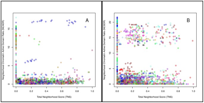
Figure 7. Neighborhood-level chromatin domains.
(A–B). Each point in the figure corresponds to a putative gene neighborhood. The x-axis shows its Total Neighborhood Score (TNS) and the y-axis shows the mammary-to-liver Neighorhood Chromatin (A) Active or (B) Silent Domain Ratio. Points are colored according to the chromosome on which the putative neighborhood resides. (A) The many blue points with high NCADR and high TNS correspond to the casein neighborhood (N2 in Table 1) and its derivatives.

