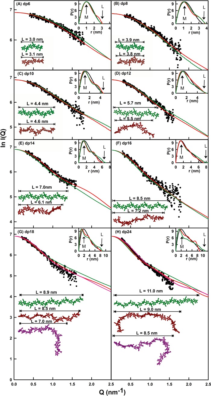
FIGURE 7.
X-ray modeling curve fits for best fit and poor fit HS dp6–dp24 models. The main panels (A–H) depict the I(Q) curve fits, and the insets show the P(r) distance distribution function fits. The experimental I(Q) and P(r) scattering data are represented by black circles or lines, respectively; the red lines and models correspond to the best fit dp6–dp24 models from the trial and error searches; and the green lines and models correspond to the linear poor fit dp6–dp24 models from Fig. 4. The best fit and linear models are shown in the left lower corner, together with their maximum lengths L in nm for comparison with the experimental L values in the P(r) curves. For dp18 and dp24, the best fit model identified from only the minimum R factor value as filter is shown in purple.

