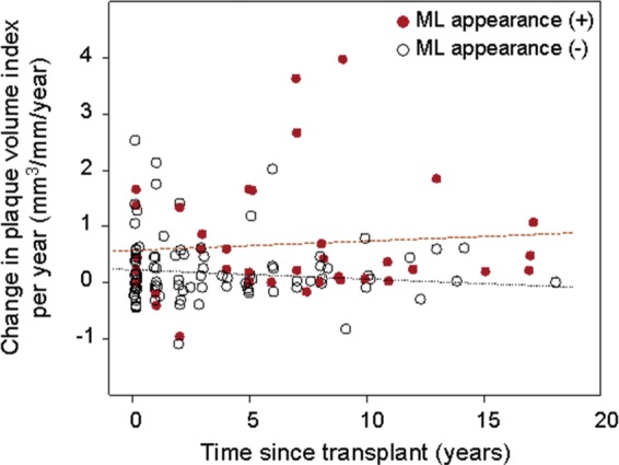
Figure A2.

Scatter plot of change in plaque volume per year (y-axis) vs. time since transplant (x-axis). Overall, there was no relationship between the rate of change in plaque volume and the time since transplant (Spearman's r = 0.085, P = 0.333). Closed circle indicates subjects with ML appearance at baseline; and open circle, those without ML appearance.
