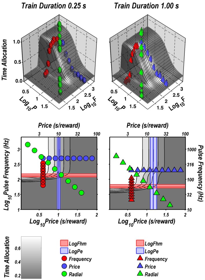
Figure 13.
Fit of the dual-integrator model to the data from rat C17. Top row: 3D surfaces showing how time allocation varies as a function of pulse frequency and price. Individual data means along the pulse-frequency (red), price (blue), and radial (green) sweeps are designated by polyhedrons (0.25 s trains) or pyramids (1 s trains). Note the indentation in the surface fit to the data obtained at the longer train duration (upper right). This indentation is due to the offset between the pulse frequencies over which reward intensity grows in the two integrators (upper and lower 3D graphs in Figure 12). Bottom row: contour graphs corresponding to the surfaces in the row above. The vertical blue line represents the estimate of Pe, and the surrounding band represents the corresponding 95% confidence interval. The horizontal red line represents the estimate of Fhm, and the surrounding band represents the corresponding 95% confidence interval. The wiggles in the contour lines in the graph for the longer train duration (lower right) correspond to the indentation in the surface shown above.

