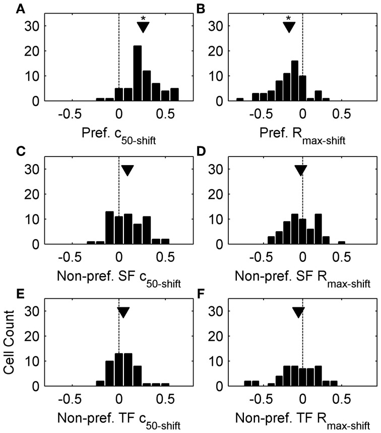
Figure 2.
Population data from top-up adaptation. (A,C,E) plot c50-shift population histograms following preferred adaptation, adaptation with non-preferred SFs, and adaptation with non-preferred TFs, respectively. (B,D,F) plot Rmax-shift population histograms following preferred adaptation, adaptation with non-preferred SFs, and non-preferred TFs, respectively. Arrowheads represent population means, and asterisks denote significant differences (see Results).

