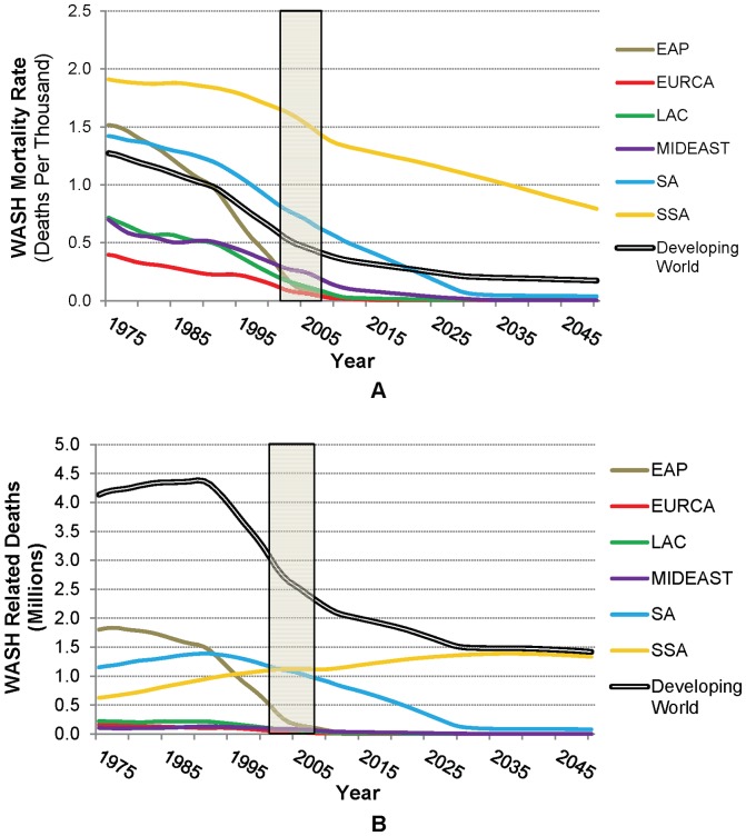
Figure 4. WASH-related disease burden in terms of (A) population-weighted mortality rate and (B) estimated number of deaths, by region (Data for 2002–2008, obtained from the WHO, are shown by the shaded area; future projections use historical GDP growth rates).
The bold black and white line in Panel A represents the population-weighted average across less-developed countries, whereas that in Panel B is the total number of deaths in less-developed countries.

