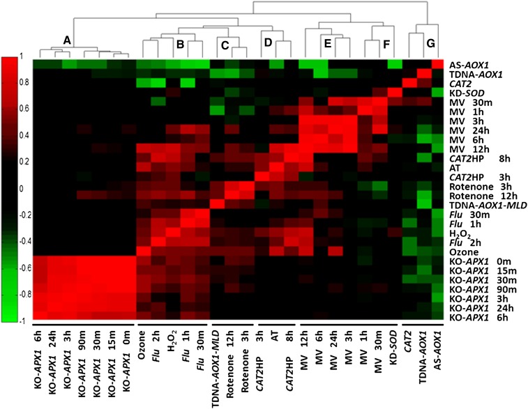
Figure 1.
Correlations between ROS indices and the ROS-related microarray data that were used to build the indices. The ROS indices are listed on the abscissa and are clustered by nearest neighbor correlation, and the ROS experiments are shown on the ordinate. The color-coded results of correlations for each index are shown as a heat map. Correlation values are between 1 (complete positive correlation; red) and −1 (highest negative correlation; green), where 0 indicates no correlation (black). The experiments are listed in Supplemental Table S1, and the numerical values of the correlation are given in Supplemental Table S2. [See online article for color version of this figure.]

