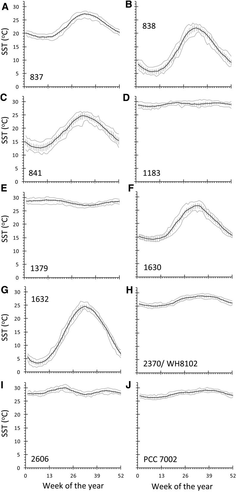
Figure 4.
Annual cycle of SST for each strain’s site of origin. The black line shows average temperature for each week, gray lines show minimum and maximum values for each week over the entire period of record, and error bars show sd for weekly mean SST values over the period January 1990 to December 2011.

