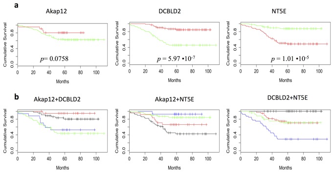
Figure 4. Survival curves of our cohort as function of the selected genes.
a. Survival curves on our CRC validation series, categorized as having high (red curve) and low (green curve) AKAP12, DCBLD2 and NT5E expression. p-value for the null hypothesis of equal population survival curves is provided by log-rank test in each graph; b. Survival curves estimated combining the expression (high and low) of all 3 markers (AKAP12, DLBLC2, NTE5). Red curve represents the combination high/high; the blue curve represents the combination high/low; the black curve represents the combination low/high; the green curve represents the combination low/low.

