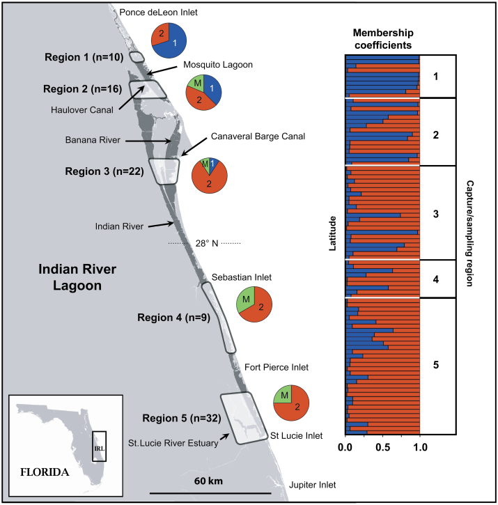
Figure 1.
Map of the Indian River Lagoon showing capture/sampling regions (1–5). Membership coefficients (Q) generated by STRUCTURE for each individual are shown in the bar chart. Each individual is positioned in the chart according to its capture/sampling latitude (region is shown in column to the right). The distribution of individuals assigned to clusters 1 and 2 for each region is shown in pie charts (1 = cluster 1, 2 = cluster 2, and M = individuals with mixed ancestry [Q < 0.75]).

