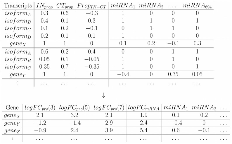
Figure 6. Representative table for constructing the model.
For each gene we determined the proportion of FPKM in each sample and calculated the differences ( ). Furthermore, we determined the miRNAs targeting transcripts (inside 3′UTRs). A total of
  were considered. The isoform has a 1 in
  if that miRNA is present in that transcript, a 0 otherwise. For each
  (eg.
(eg.  ) corresponding to one gene (e.g.
  ), the
  vector is multiplied by the presence/absence vector of
  (with assigned 1 s and 0 s). The intermediate result is, thus, a vector having the respective
  value if
  was present in the isoform and 0 otherwise (
 ). The resulting vector
  is summed giving a total value for
  for
for  (
( ). This represents the mean weighted usage of the miRNA in that specific gene. Larger positive values indicate that the miRNA is used more (appears more often) in IN than in CT. Larger negative values represent a higher usage in CT (values around 0 indicate same usage in both). The same procedure is done for each miRNA (so a vector of
  values is assigned to
  ) and for each gene. The gene wise table below in addition to showing the resulting values calculated above, also shows the other data needed for the model; the logFC
 values (at day 3, 5 and 7, from Molina et al.) and the respective logFC
 values (our data).

