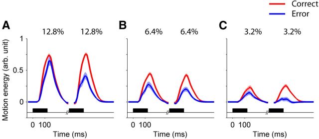
Figure 4.
The second pulse had the larger influence on choice. Each panel shows the average motion energy profiles for the first and second pulses, sorted by choice. Only trials with equal pulse strength are included. The shaded region around the mean indicates SEM. The black horizontal bars show the stimulus presentation period. Data were pooled for all nonzero interpulse intervals. Motion coherences are indicated at the top of each panel: A, 12.8%; B, 6.4%; C, 3.2%. The units of motion energy are arbitrary, but are identical for all motion strengths. The degree of influence on choice can be ascertained by comparing the energy accompanying correct and erroneous choices (red and blue, respectively).

