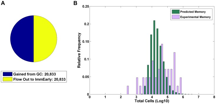
Figure 5. Analysis of the memory compartment.
A) The size of the infected memory compartment and flow rates through this stage is shown graphically as a pie chart. The left half shows gains by the population and the right half shows the losses. Since the system is at equilibrium, the population size is constant and the gains must equal the losses, i.e., the size of the two halves of the pie chart must be the same. B) To test how well the range of values predicted for the memory compartment by CPM compared to what is seen biologically, we calculated the predicted steady state size of the memory compartment for 10,000 randomly chosen parameter sets (green bars) and compared this to the actual number of EBV infected memory B-cells in Waldeyer's ring for 42 independent tonsils from persistently infected individuals (purple bars). The predicted values have a similar mean and median value as compared to the experimental data (log mean: biological 4.48; CPM 4.36; log median: biological 4.65; CPM 4.31; p-value = 0.079 using a two-sided, unpaired, two-sample Mann-Whitney test).

