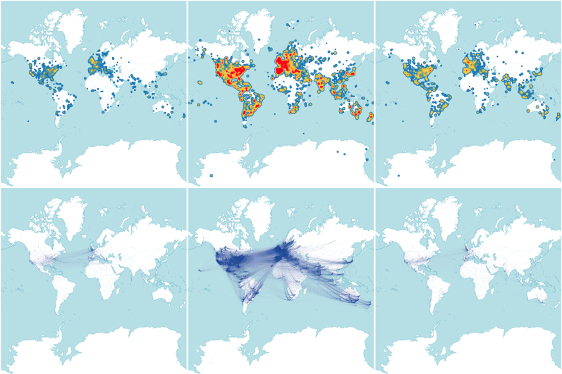
Figure 3.
Top: heatmap for the density of tweets before (left panel), during (middle panel) and after (right panel) the main event on 4th July 2012. Bottom: corresponding networks of re-tweets between users. During the announcement, the Twitter activity is truly global, whereas before and after the announcement, the most active countries were European and American, due to the large presence of scientists in these geographic areas. The map in this figure was generated using TileMill and data from OpenStreetMap contributors, available under the Open Database License (see http://www.openstreetmap.org/copyright).

