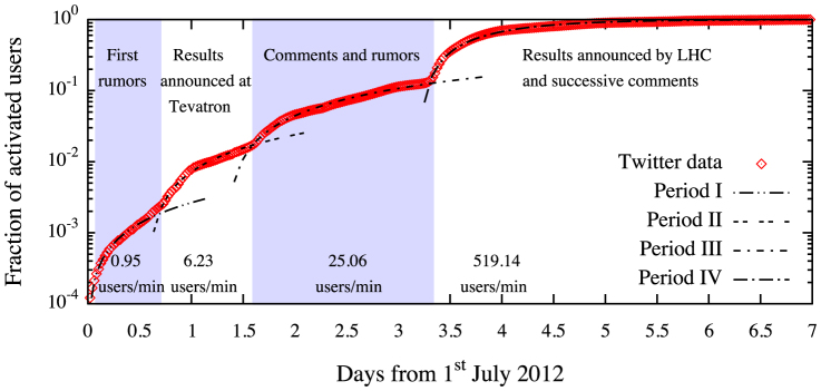
Figure 7. Points indicate the fraction of users who are active at least once (see the text for more detail) with respect to the total number of users in the dataset at the end of the period taken into consideration, i.e.,  (t = 8 July 2012), as a function of time.

Lines indicate the fitting results obtained separately for each temporal range by adopting the model given by Eq. (3). The rate of activation  for each period is reported at the bottom of the figure.
