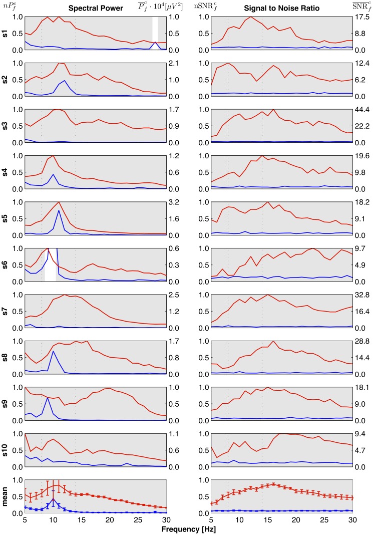
Figure 4. SSVEP frequency response curves.
Columns correspond to the method of SSVEP evaluation: Left – spectral power, right – Signal to Noise Ratio. Rows 1–10 correspond to individual subjects, last row shows the response averaged across 10 subjects. Horizontal axis – stimulation frequency. Vertical axes have two scales. In the left column: left scale – normalized power  , right scale – absolute mean power
  . In the right column: left scale – values of
  , right scale – values of
  . Error bars indicate the RMS error. Each plot presents two curves: the blue line shows values obtained for NVS, and the red one for VS condition. The gray regions in rows 1–10 mark the frequencies, where the given measure (column) gives significantly higher result for VS than NVS epochs for the a given subject (row) – results of within-subject level tests. The gray color on the plots in the last row means significant reactive frequencies for the population. Dotted vertical lines at 8 Hz and 13 Hz mark the range of the
  -band. Note: For S6 in left column the blue line exceeds the shown range to reach the value of
  .
.

