
Figure 4. Heat map illustrating how incidence of epidemics change with changing birth rate and amplitude.
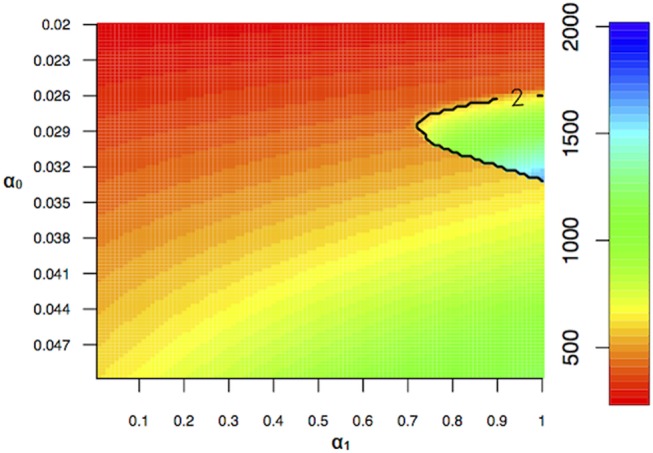
The contour plot illustrates the transition from annual to biennial epidemics. The timing of the epidemic did not change significantly with changing birth rate ( ) and amplitude (
 ). (
). ( = 0,
= 0,  = 1000,
  = 0).
= 0).