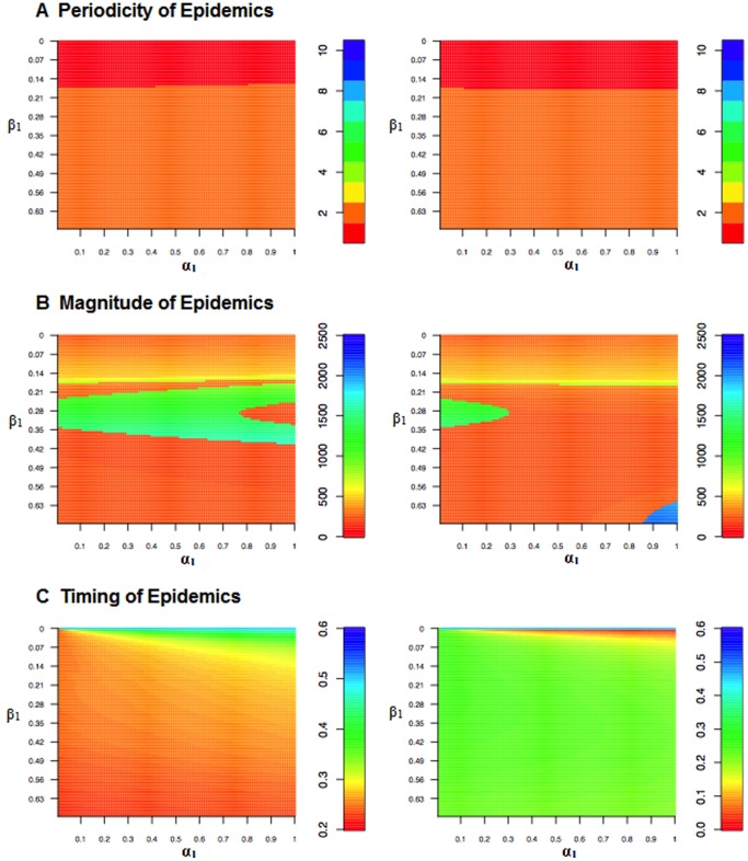
Figure 6. Heat maps illustrating how periodicity, incidence, and timing of epidemics change with varying levels of transmission ( ) and birth (
 ) amplitudes.
In the figures on the left, the two seasonal forcers have the same phase, in the figures on the right, the phases are out of synch. ( = 20/1000,
  = 1000).

