
Figure 1.
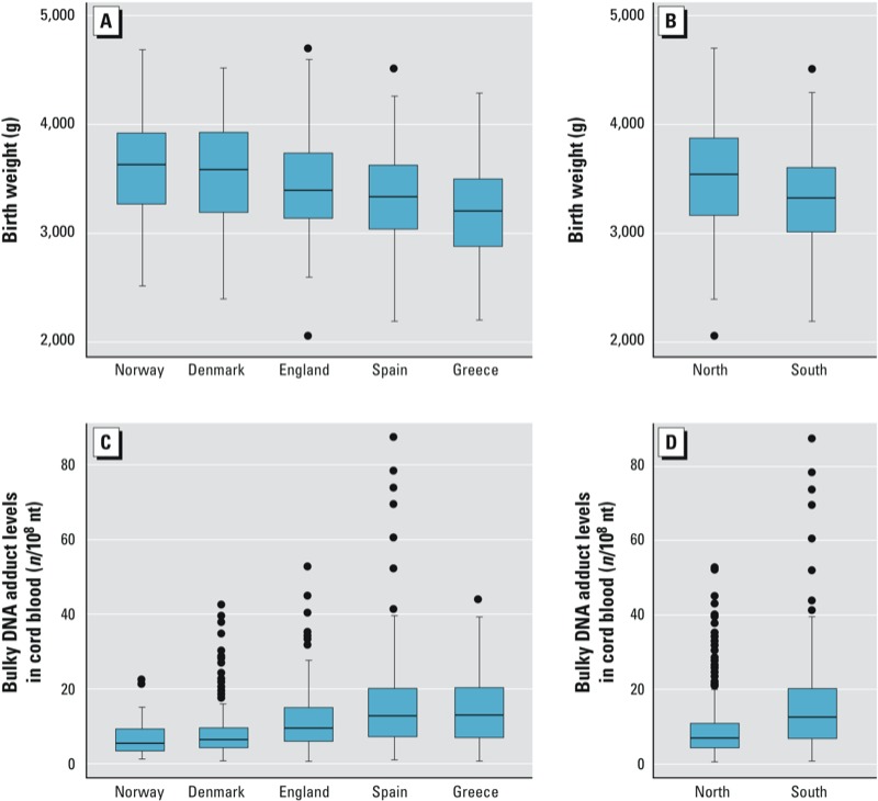
Birth weight (A–B) and bulky DNA adduct levels in cord blood (C–D):distribution by country (A,C) and region (B,D). The horizontal line is the median, and the bottom and top of the box are the first and third quartiles. Whiskers indicate the variability outside the upper and lower quartiles (i.e., within 1.5 interquartile range of the lower quartile and upper quartile). Outliers are plotted as individual dots.