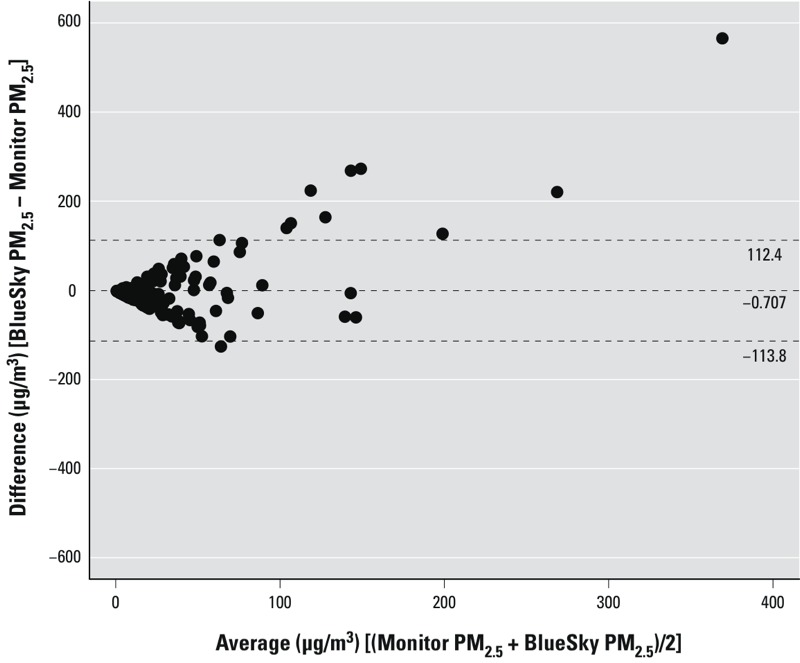
Figure 2.

Bland–Altman plot of BlueSky PM2.5 versus Monitor PM2.5 measurements, excluding all pairs with zero BlueSky predictions. The x-axis is the average of BlueSky forecasts and monitor measurements, and the y-axis is the difference between the two. Points above zero suggest overpredictions from BlueSky compared with monitors. Dashed lines indicate mean ± 2 SD.
