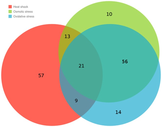
Figure 4. Visualization of the difference among the three top 100 sets of proteins having the highest perturbation centrality in the DIP (2005) yeast interactome.
Perturbation centralities were calculated for three stressed variations of the DIP (2005) yeast interactome according to Methods. The properties of the network as well as the method of generating its stressed versions are described in the Supplementary Methods. The sizes of the different areas of the diagram are roughly proportional to the number of proteins in the respective combination of the three sets. Numbers also show the number of proteins in different sets. This quantitative Venn diagram was generated using the Google Charts API. (https://developers.google.com/chart/image/docs/gallery/venn_charts). The red, green and blue circles show the sets of top 100 proteins having the highest perturbation centrality in the heat-shocked, osmotically- stressed and oxidatively- stressed networks, respectively. This figure illustrates the fact mentioned in the Section “Various stress types induce different perturbation dissipating regions of the yeast interactome” that the most important proteins in heat shock are substantially different from the most important proteins in the other two tested stress types (i.e. in osmotic and oxidative stresses).

