
Figure 1. Graphical outline of the Drift Diffusion Model (DDM).
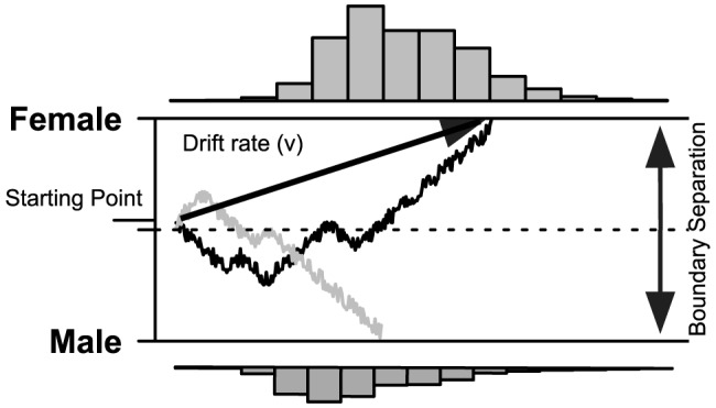
The two sample paths represent accumulation of evidence from a presented female face stimulus; resulting in either a correct (black line) or incorrect response (grey line). As shown in the RT histograms, responses more often accumulate towards a correct choice (above) than an incorrect choice (below). Drift rate ( ) represents the average amount of evidence accumulated per time unit. Boundary separation (
 ) represents how much evidence is needed before a definitive response is made.