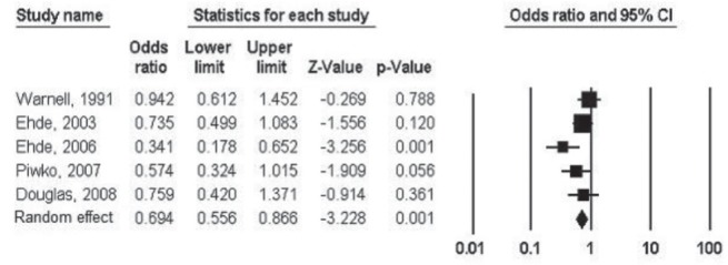
Figure 2).

Forest plot of the effect of pain on employment status. The far left column lists the names of the studies, in chronological order, and the far right column shows a plot of comparison. For each study, the OR is shown as a square, with area proportional to the sample size. The 95% CI is represented by the horizontal line around each square. The vertical line in the middle is called ‘the line of no effect’, which visually displays the study overall results (42). The bottom line on this plot is marked ‘Random’ and shows the combined effect or difference for the studies (44). The overall OR and 95% CI are plotted by the diamond in the last row of the graph. Because the diamond does not cross the ‘line of no effect’, the calculated difference between groups is considered to be statistically significant (42). The OR falls below 1, indicating that patients with multiple sclerosis pain were less likely to be employed than individuals with multiple sclerosis without pain
