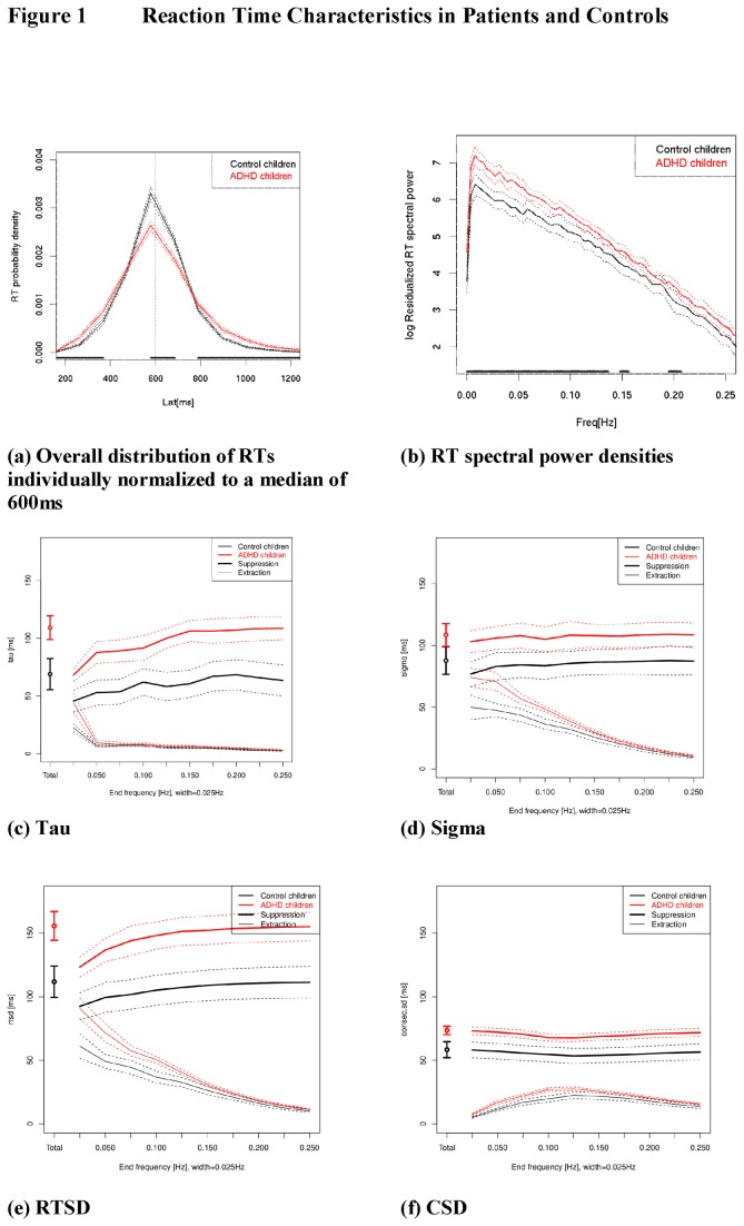
Figure 1. Averages (solid lines) with 95% confidence intervals (dotted lines) are shown for controls (in black) and patients (in red).
The black bar above the x-axes in figures a and b indicates an uncorrected point-wise “p<.05” difference between the groups to provide an indication where group effect sizes are considerable. “Suppression filters” (upper, thick lines in Figure 1 c-f) demonstrate the impact of removing each particular frequency band from the RT time series on the group aggregate of the individual variability scores; the “extraction filters” (lower, thin lines in Figure 1 c-f) show the said measures of variability for each RT time series frequency band alone. Suppression and extraction filters are therefore complementary ways of visualising one and the same relationship.

