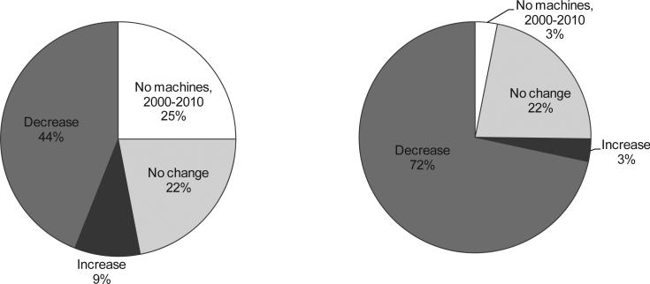
Figure 2. Change in mammography capacity in all US counties, 2000-2010.
The panel on the left shows the unweighted distribution of counties by change in mammography capacity over the study period. The panel on the right shows the distribution of counties by change in capacity weighted by county share of women age 40 and older. Change in capacity was estimated from the slope of a regression line for each county fit through capacity estimates in each year, 2000-2010. Counties with an increase (decrease) in capacity were defined by a positive (negative) estimated slope that was significantly different from 0 by t-test at a<0.05.

