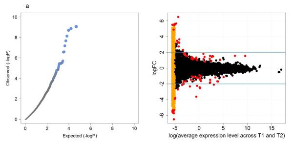
Figure 1.
QQ plot and visualization of differentially expressed genes.
Left panel (a): It shows a quantile-quantile (QQ) plot in which the expected distribution of −log10(p-value) is compared to the observed distribution. The gray area denotes 95% confidence bands for the expected distribution. The observed distribution deviates sharply from the expected, consistent with a small number of genes with differential expression. Right panel (b): The top 100 differentially expressed genes identified using gene-wise dispersion are highlighted in red. The orange points on the left represent transcripts with counts of zero at either T1 or T2. Blue lines denote log2FC of ±2. (FC is fold change.)

