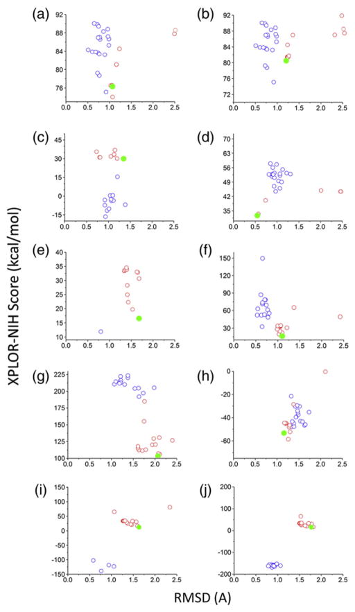
Fig. 6.
Energy profiles versus RMSD to native after refinement with Xplor-NIH. Blue circles show the RMSD between the starting native model (from the NMR ensemble) and the native model after refinement with Xplor-NIH. Red circles show the RMSD between each of the centroids and the corresponding native structure. The filled green circles represent the most favorable scoring model among the 20 centroid models. Only models with RMSD values below 2.5 Å are displayed on the graph. The panels are labeled as follows: (a) GpA, (b) GpA(Cross-linking), (c) EphA1, (d) BNIP3, (e) M2(xtal), (f) M2(NMR), (g) BM2, (h) phospholamban, (i) M2(ssNMR1), and (j) M2(ssNMR2).

