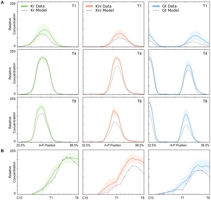
Figure 3. Comparison of model output and measured protein concentrations.
(A) Spatial profiles of Kr (green), kni (red), and gt (blue) for early (T1), mid (T4), and late (T8) time classes during C14A. X-axes represent A–P position (in %), Y-axis show relative concentrations (as in Figure 2A). (B) Temporal dynamics of peak concentrations for the central Kr domain (left), the abdominal kni domain (centre), and the posterior gt domain (right). X-axes represent time, Y-axes show relative concentrations (as in Figure 2C). In all panels, model output is shown as a dashed black line; measured protein concentrations are shown as dark colored lines (mean) and lightly shaded background (standard deviations).

