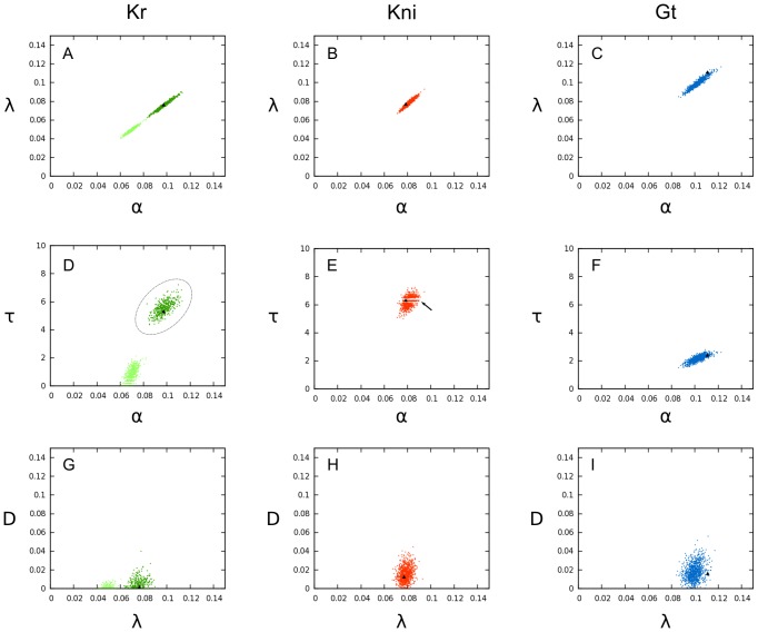
Figure 6. Parameter distributions obtained from bootstrapping.
This figure shows illustrative examples of scatter plots for parameter values derived from  fits to simulated noisy data (sampled from the distributions of protein data measurements; see Figure 3 for mean and standard deviations of spatial expression profiles). Parameter values for Kr are shown in green (left column, A, D, G), for kni in red (centre column, B, E, H), and for gt in blue (right column, C, F, I). Parameter notation:
  (production rate),
  (decay rate),
  (diffusion rate), and
  (production delay; see equation 1). Black triangles indicate the original parameter estimate obtained with unperturbed data. Dashed ellipse around parameter values for Kr (in D) indicates parameters selected for further analysis. Arrow in E indicates striped interference pattern in the distribution of kni parameter values. See text for details.

