
Figure 2.

Analysis of promoter prediction results. (A) Promoters are ordered by increasing 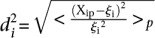 , where
  is the predicted value of promoter i and participant p = 1,2…21 , and
  is the measured value for promoter i = 1,2…53. Green dots represent the 30 best predictions, and red dots the 23 worst predictions. Empty dots represent the 20 wild-type promoters; full dots represent the 33 mutated promoters. (B) The Pearson correlation of each of the participating teams is shown in green dots for the best predictions and in red dots for the worst predictions as defined in A. Teams are ordered by rank based on their final score. (C) For each promoter, χi is plotted in logarithmic scale against the promoter activity value. Empty dots represent wild-type promoters and full dots mutant promoters.