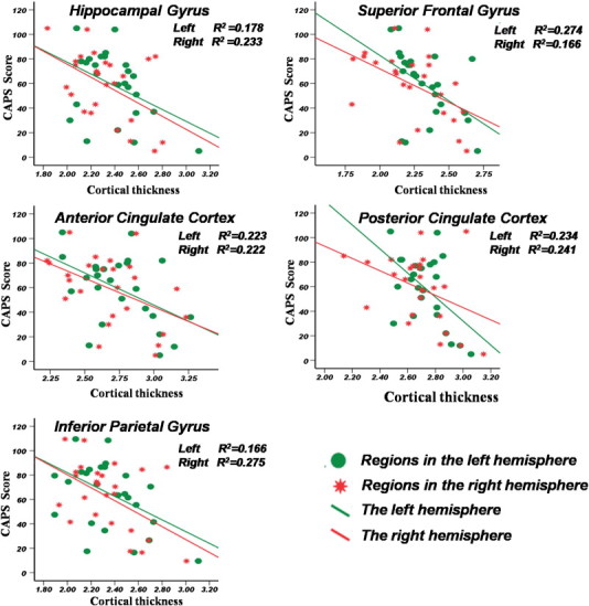
Fig. 3.

Correlations between CAPS and regions thickness analysis.
X-axis represents the mean cortical thickness where the cortex with significant change. Y-axis represents the CAPS score value, the Pearson's correlation analysis was used, the r2 value was shown in the top right corner. The green circles represent the absolute regions values in the left hemisphere. The red stars represent the absolute regions values in the right hemisphere. (For interpretation of the references to color in this figure legend, the reader is referred to the web version of this article.)
