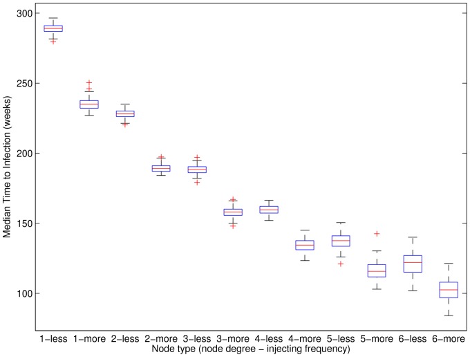
Figure 3. Median time to primary infection across 100 simulated networks.
Boxplots are for results for each of 12 categories (node degrees 1–6; two injecting frequencies) over 100 networks. Injecting behaviour frequency is denoted as “less” (i.e., less than daily) or “more” (i.e., at least daily). For each network, results are formed from 3000 HCV simulations as the median for each node as both a less frequent and a more frequent injector, and then the median for each of the 12 groups. Boxes show the 25-th and 75-th percentiles. The central line denotes the median, the whiskers show the range of data not considered outliers, and outliers are shown individually. More frequent injecting behaviour is approximately equivalent to being a less frequent injector with one additional network contact.

