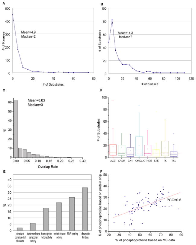
Fig. 1. Statistics of human phosphorylation network.
(A) The number of kinases per substrate and (B) the number of substrates per kinase are plotted. Mean and median values are shown. (C) The distribution of substrate overlap rate among all possible kinase pairs. Supposing A and B are the substrate sets of a pair of kinases, the overlap rate is defined as Jaccard Index (A∩B)/(A∪B). (D) The distribution of substrate numbers per kinase among different kinase groups. The bottom and top of the boxes represent the 25th and 75th percentile of the distribution, respectively. The line near the middle of the box represents the 50th percentile. The empty squares in each box indicate the mean. The whiskers represent the 9th percentile and the 91st percentile. The dashed line across the figure indicates the overall average number of substrates per kinase identified in this study. (E) The distribution of phosphoproteins across various protein families. The Y-axis represents the fraction of proteins identified as kinase substrates in each of the six major protein families indicated. (F) The phosphoprotein percentage for different functional groups. Each point corresponds to one functional group (i.e., a GO term, such as “RNA-binding proteins”). The X-axis is the percentage calculated based on MS/MS data while the Y-axis is based on our protein microarray data. A good correlation between these two independent studies is observed. PCC, Pearson correlation coefficient.

