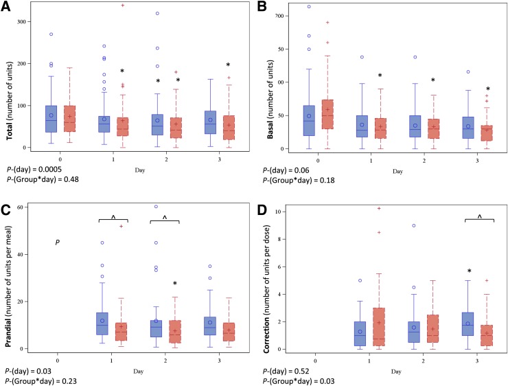
Figure 1.
Box plots summarizing total insulin dose (A), basal insulin dose (B), mean prandial dose per meal (excluding meals where patient was NPO) (C), and mean correction insulin per dose (D). Plots with solid lines and circles (○) indicate the fixed dose group, and plots with dashed lines and plus (+) signs indicate the flexible dose group. Day 0 indicates the TDD for total insulin and the admission dose for basal insulin. The horizontal line within the box represents the median value, and the top and bottom of the box represent the 75th and 25th percentiles, respectively. The whiskers represent the highest and lowest data point still within the following values: 75th percentile + 1.5 × (IQR) (top), and 25th percentile – 1.5 × (IQR) (bottom). If the data points do not reach the computed ranges, then the whiskers are represented as the highest and lowest data point. P-(day) indicates the P value for change in daily dose in the pooled sample, and P-(Group*day) indicates the P value for between-group difference in overall trend. *P < 0.05 vs. baseline within group; ^P < 0.05 between groups. P values determined from mixed linear models with natural log-transformed insulin values.

