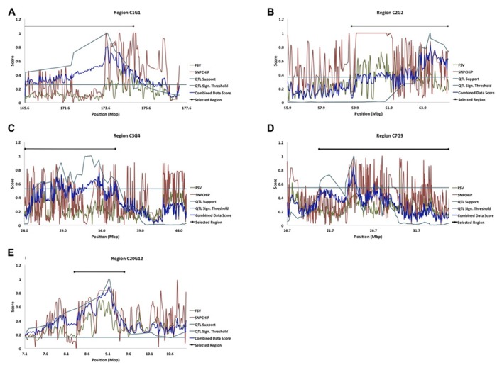
FIGURE 2.
(A–E) Five of the fine-mapped growth QTL regions based on model B (QTL Support curve), and their significance threshold (QTL Sign. Threshold line) as in Besnier et al. (2011). The FSV curve represents FSV computations from resequenced NGS data from the HWS and LWS lines (Marklund and Carlborg, 2010), the SNP chip curve represents allele frequency differences between HWS and LWS from SNP genotyping, and the combined data score curve represents the formulated score from all of the above stated dataset curves. The Selected Region line represents the selected candidate regions for bioinformatic analysis of genes and mutations.

