
Figure 1.
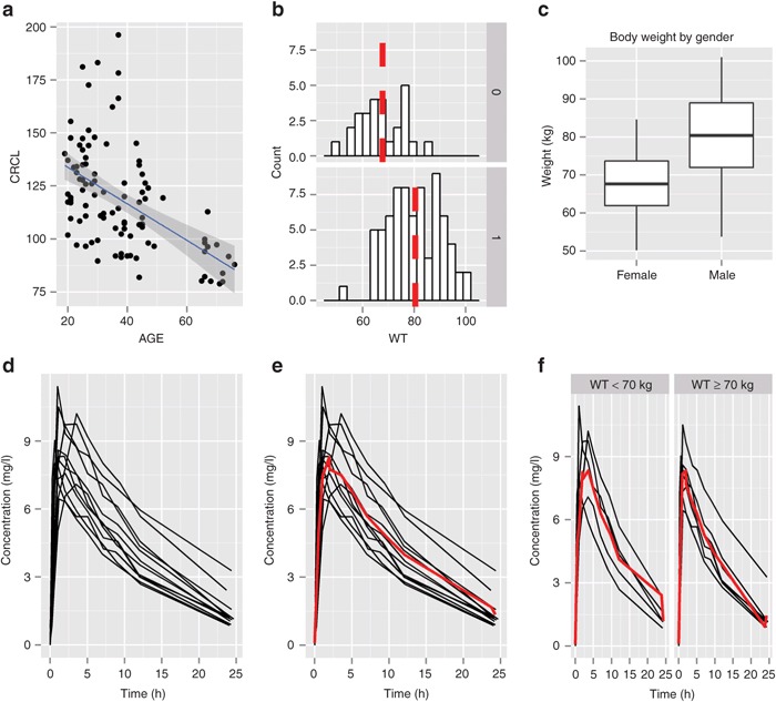
Example plots using ggplot2. (a) Scatter plot adding a layer of a linear regression line. (b) A histogram by gender (using facet_grid) adding a layer for median value for each panel. (c) A box plot conditioned by gender (using aesthetic mapping) with a customized title and x and y labels. (d) A spaghetti plot for Theoph data (nlme package). (e) Add a mean line to the spaghetti plot. (f) A spaghetti plot by covariate (body weight category) using facet_grid().