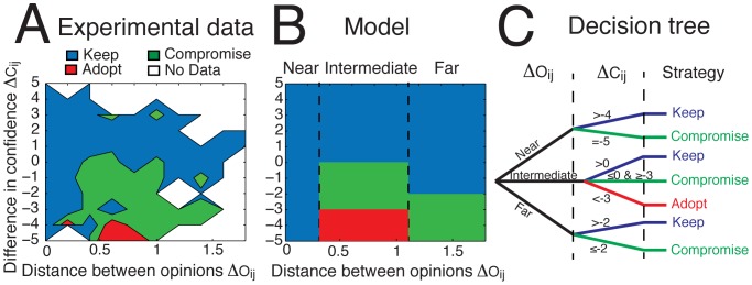
Figure 3. (A) The influence map extracted from our experimental data and (B) a simplified representation of it as implemented in the model. The color coding indicates the heuristic that is used by a majority of people, as a function of the difference in confidence  and the distance between the normalized opinions
  . Positive values of
  indicate that the focus subject is more confident than the influencing individual (called feedback), whereas negative values indicate that the focus subject is less confident. White zones in (A) indicate the absence of sufficient data. Although the majority of people prefer to keep their initial opinion when they are more confident than their partner (i.e. the blue strategy dominates for
  ), a zone of strong influence is found at an intermediate distance with
  . (C) The decision tree describing the decision process with three different outcome strategies. The individual first looks at the distance between opinions
  , then looks at the difference of confidence
  , and finally chooses a strategy accordingly.

