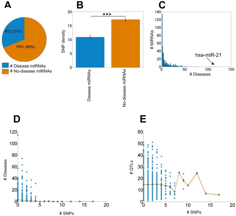
Figure 5. Analysis of SNPs in miRNAs associated with diseases and QTLs.
Part A shows the proportion of disease miRNAs in all the miRNAs. Part B shows the comparisons of SNP densities in disease miRNAs and no-disease miRNAs with two sample one tailed  test. In part B, *, ** and *** means
  -values smaller than 0.05, 0.01 and 0.001, respectively. Error bar indicate the SEM. Part C shows the distribution of the numbers of associated diseases for miRNAs in HMDD. Part D shows the number of SNPs and the number of associated diseases of the miRNAs. MiRNAs are grouped into different groups according to the number of SNPs in them and the average numbers of associated disease for all groups were calculated, shown as green triangles. The green triangles are connected with yellow lines. Part E shows the number of SNPs in the miRNAs and the number of QTLs which the miRNAs are overlapped with. MiRNAs are grouped into different groups according to the number of SNPs in them and the average number of QTLs for each group was calculated, shown as green triangles. The green triangles are connected with yellow line.

