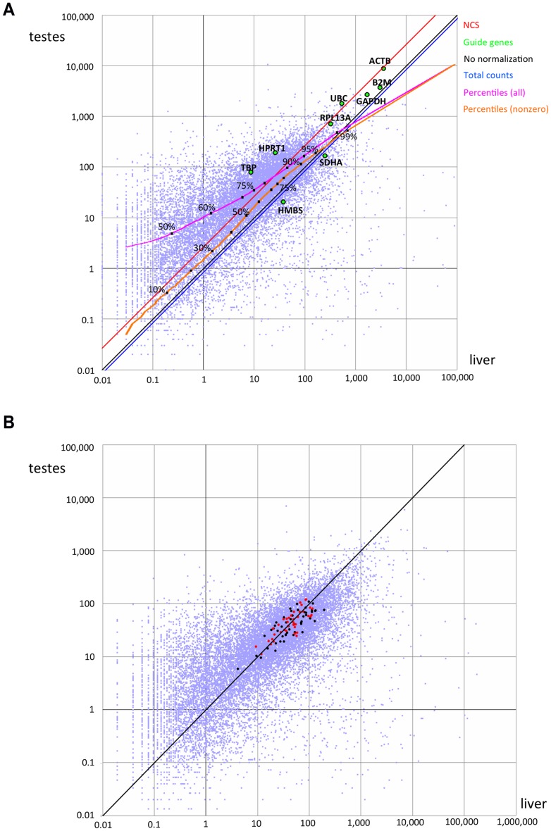
Figure 2. Pairwise comparison of expression levels.
We compared the levels of expression of 15,861 genes with nonzero expression levels in both liver and testes, expressed in terms of average coverage per base. Each point represents one gene. A) Data prior to normalization. Housekeeping genes are highlighted as green points and labeled. The blue and red diagonals represent the relative correction factors computed based on total counts or the NCS method, relative to no normalization (black). The magenta and orange curves depict the percentiles when considering all genes or genes with nonzero values, respectively. B) Values after correction by NCS. Points in black or red denote genes with positive weights, and that therefore guided the scaling. Points in red denote the 39 genes with weight >0.5.

