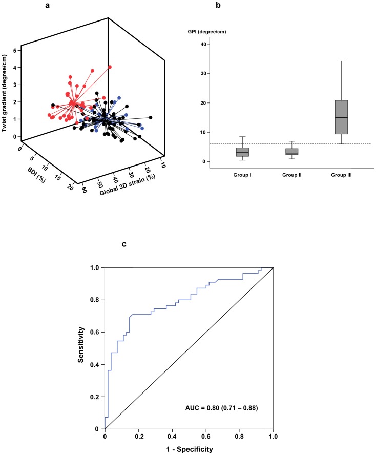
Figure 4. Assessment of left ventricular function by the global performance index (GPI).
(a) The 3D global performance plot showing different left ventricular performance in group I patients (black), group II patients (blue), and controls (red). The centre point for each group represents the mean of the values in the x-, y-, and z-axes. (b) Box-plots showing the GPI in the three groups of subjects. The dotted line represents the 10th centile line derived from normal control data. (c) The receiver–operator characteristic curve for GPI to discriminate between patients (group I and II) and controls. AUC, area under curve.

