


Figure 2.
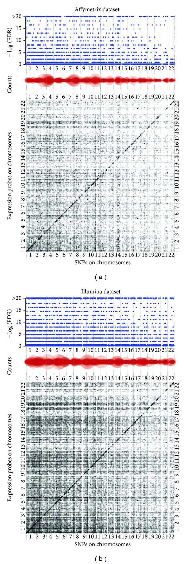
eQTL visualization. The main plot at the bottom is the scatter plot of the eQTL-transcript association. Each dot denotes a significant association between a SNP and a transcript (P value <10−5). Gray color shows the level of significance where dark means more significant association. SNPs are arranged according to their chromosomal loci along the X-axis from chromosome 1 to 22, and genes are arranged along Y-axis in the same way. The dots along diagonal line indicate cis-eQTLs, otherwise, trans-eQTLs. The counts plot in the middle gives the number of genes that a SNP correlated with significantly (P value <10−5). Large size means more genes associated with that SNP. The −log10 (FDR) plot at the top presents the enrichment score of a SNP associated with multiple transcripts comparing with that by chance. SNP has a large circle in counts plot and a high enrichment score in −log10 (FDR) plot which indicates eQTL hotspots.