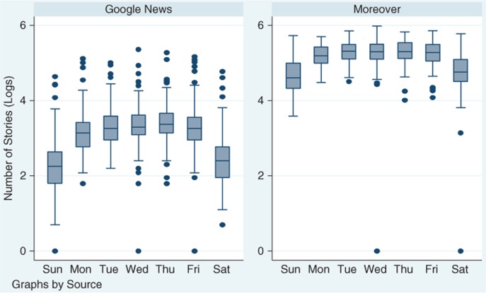
Fig. 3.
Natural log of the number of HealthMap alerts by day of the week.
Note: the rectangle marks 25th and 75th percentile distributions; the middle line is the median; whiskers mark the upper adjacent line (which represents 1.5 times the interquartile range); the dots represent extreme values and outliers.

