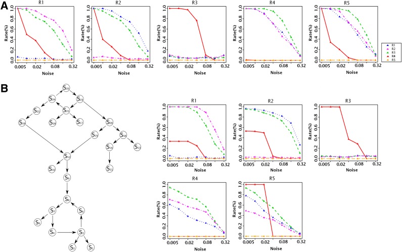
FIG. 5.
(A) Small network simulations. Each of the five plots corresponds to one true relation. The x-axis shows the different noise levels. The y-axis shows the relative frequency of rejecting the relations (R1: blue, R2: purple, R3: green, R4: red, and R5: orange). (B) Simulations on a large network. Left: The ground truth network. Right: Performance plots that organized like in (A).

