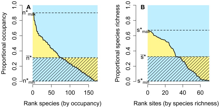
Figure 1. Rank distribution and rank diversity plots.
Hypothetical example showing species ranked by their occupancy or range size (A), and sites ranked by their species richness (B). The area of the blue rectangle equals the number of species (in A) or the total number of sites (in B). Yellow areas measure the unevenness of the range-size (A) or species-richness frequency distributions (B), and the shaded areas are equal to the average species richness of sites (in the plot by species, A) or the average range size of species (in the plot by sites, B).

