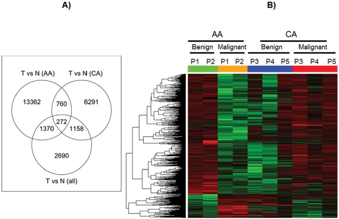
Figure 5. DNA methylation profile in ECs from African American and Caucasian American.
A) Venn diagrams Venn diagrams showing the overlap of the differentially methylated loci derived from tumor vs. normal comparison from all paired samples with those from AA group only and CA group only. B) Heat map for loci whose methylation changes of tumor versus normal in AA group are significantly different from that in CA group. In heat map, red means hypermethylated while green means hypomethylated. Green and orange bar stand for normal and tumor respectively in AA samples, while blue and red bar stand for normal and tumor respectively in CA samples.

