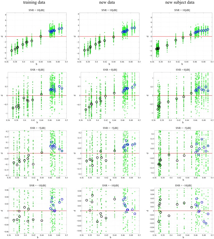
Figure 4.
Classification of different data sets at different SNRs. Each subplot maps the output d value against the input b. Small dots signify the classification of each, individual trial of the 50 trial set. The PD subjects (dark green dots) have more negative d values and the CO subjects (light green dots) have more positive d values with zero selected as the hyperplane and plotted as a continuous red line. The larger circles represent the mean d for over all 50 trials for each subject; black circles correspond to PD and blue circles correspond to CO groups. The performance of the DDE classification algorithm on the training data, new data, and new subject data is plotted from left to right respectively. SNR ranges 10:−10 dB and decreases from top to bottom. The system shows noise invariance up to −5 dB after which the ability to discriminate between the two classes decreases dramatically. At high SNR the bifurcation parameter b is linearly correlated to the output d.

