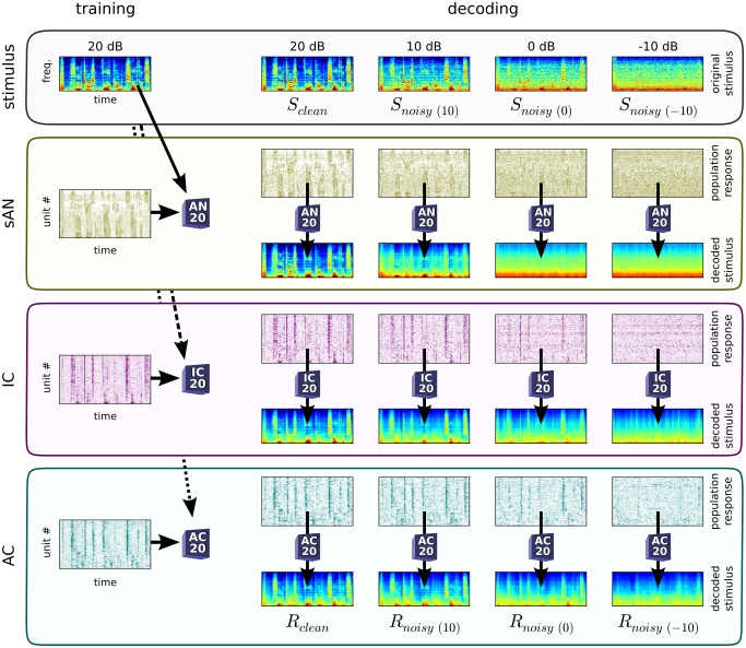
Figure 6. Decoding the population representations of clean and noisy sounds.
Schematic of the decoding of neural responses. For each auditory center, a decoder was trained to reconstruct the clean sound spectrogram from the population responses to the clean sounds. We then measured the performance of these decoders when reconstructing spectrograms from the responses to both clean and noisy sounds. Top row, spectrogram of a 2(20 dB SNR) and noisy (10/0/−10 dB SNR) conditions. Left column, decoder training from responses to clean sounds. Population responses are shown as neurograms: each row depicts the time-varying firing rate of a single unit in the population; rows are organized by CF. Right, reconstructed spectrograms ( ) from population responses to noisy sounds, using the same decoders as trained on the left. The similarity between the reconstructed spectrogram
  and the presented spectrogram
  is measured by
  ; likewise, the similarity between
  and the original, clean spectrogram
  is measured by
  . The tendencies for the sAN decoder to produce
  -like spectrograms, and the IC and AC decoders to produce
  -like spectrograms, are most visible for the 0 dB and −10 dB conditions.

