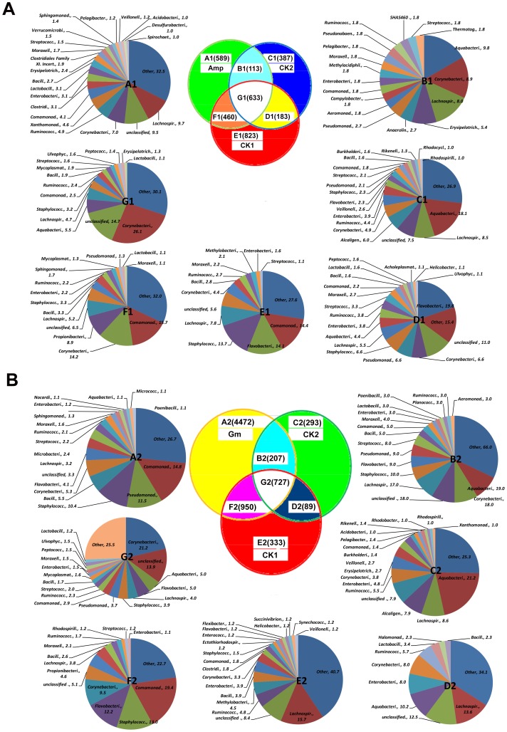
Figure 3. Distribution of the bacterial OTUs in response to antibiotic treatments.
In the Venn diagram, the numbers in parentheses represent the number of bacterial OTUs that occurred in each antibiotic treatment [ampicillin (Amp) and gentamicin (Gm)], disease controls (CK1), healthy control (CK2) and their intersections. Pie charts A to G correspond to the appropriately labeled Venn diagram areas (A1 to G1 for the Amp treatment and A2 to G2 for the Gm treatment) and show families that contained over 1% of the total OTUs in each area. In pie charts A to G, the names of the families are followed by their frequencies as a percentage (%).

