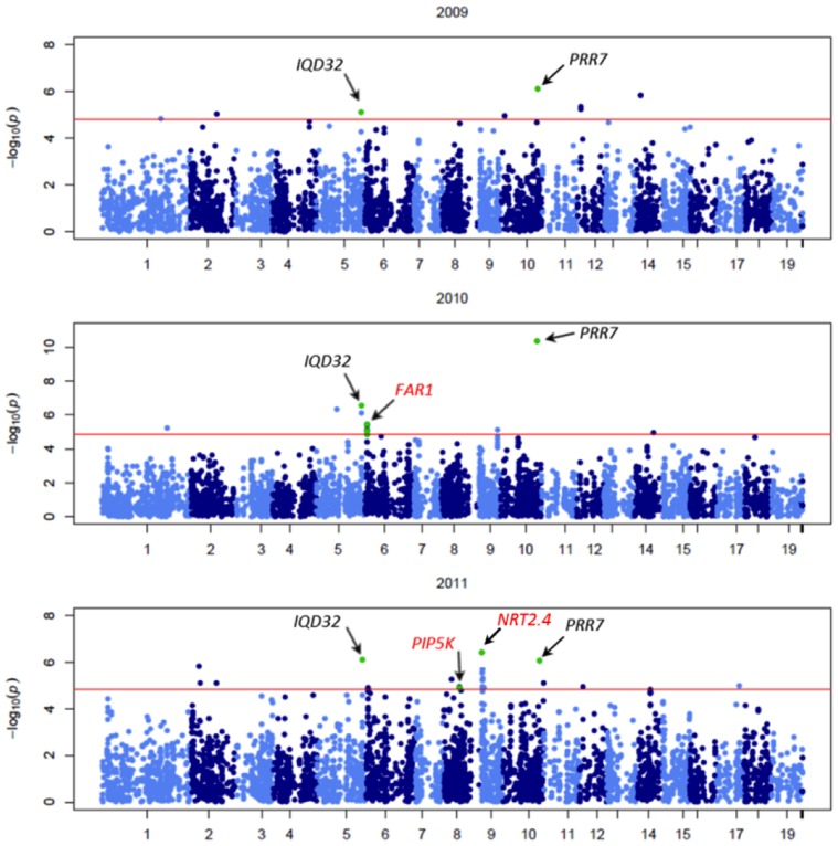
Figure 2. Manhattan plot of the results from association analysis for AUDPC in 2009, 2010, and 2011 (from top to bottom).
The red line represents the P value (P<1.45×10⁻⁵, P<1.15×10⁻⁵, and P<1.35×10⁻⁵ in 2009, 2010, and 2011, respectively) corresponding to permutated P of α = 0.05 as the threshold for multiple testing corrections. SNPs repeated in time are highlighted in green and identified by gene name in black. SNPs within genes showing expression profile changes in response to M. larici-populina are highlighted in green and identified by gene name in red.

