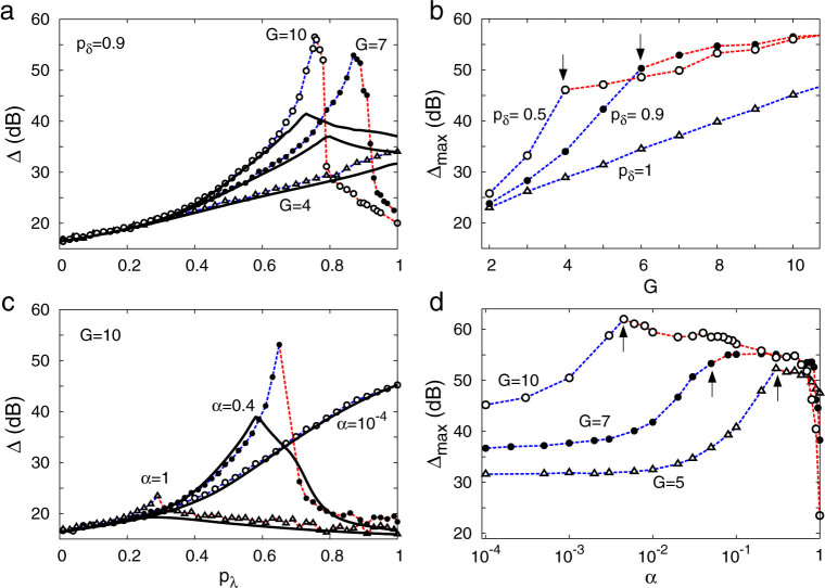
Figure 4. Dynamic range Δ.
(a) and (b), for homogeneous distribution of pδ. (c) and (d), for layer-dependent distributions:  . (b) and (d) depicts Δmax which is the maximum of the Δ(pλ) curve. In each curve phase transitions occur only at and on the right hand side of arrows. Symbols connected by dashed lines represent simulation results whereas continuous lines represent the generalized excitable-wave (GEW) mean-field approximation.

